SHOWCASE
RECOVERY
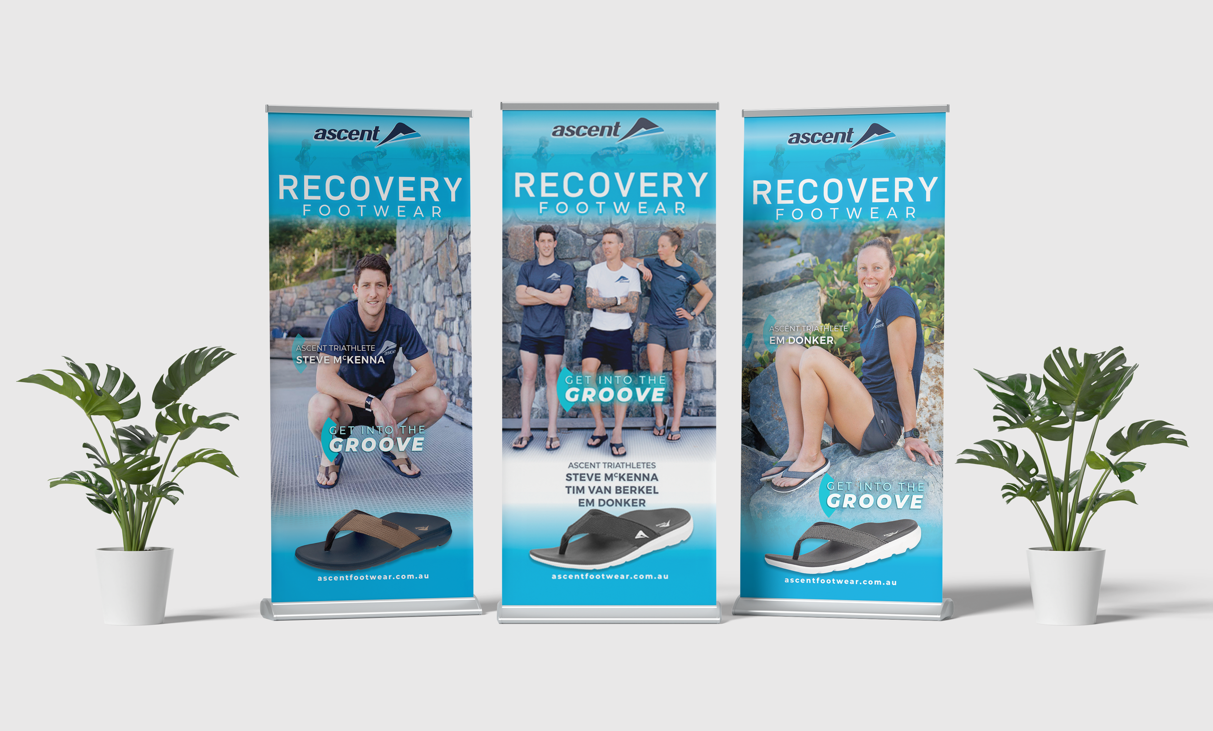
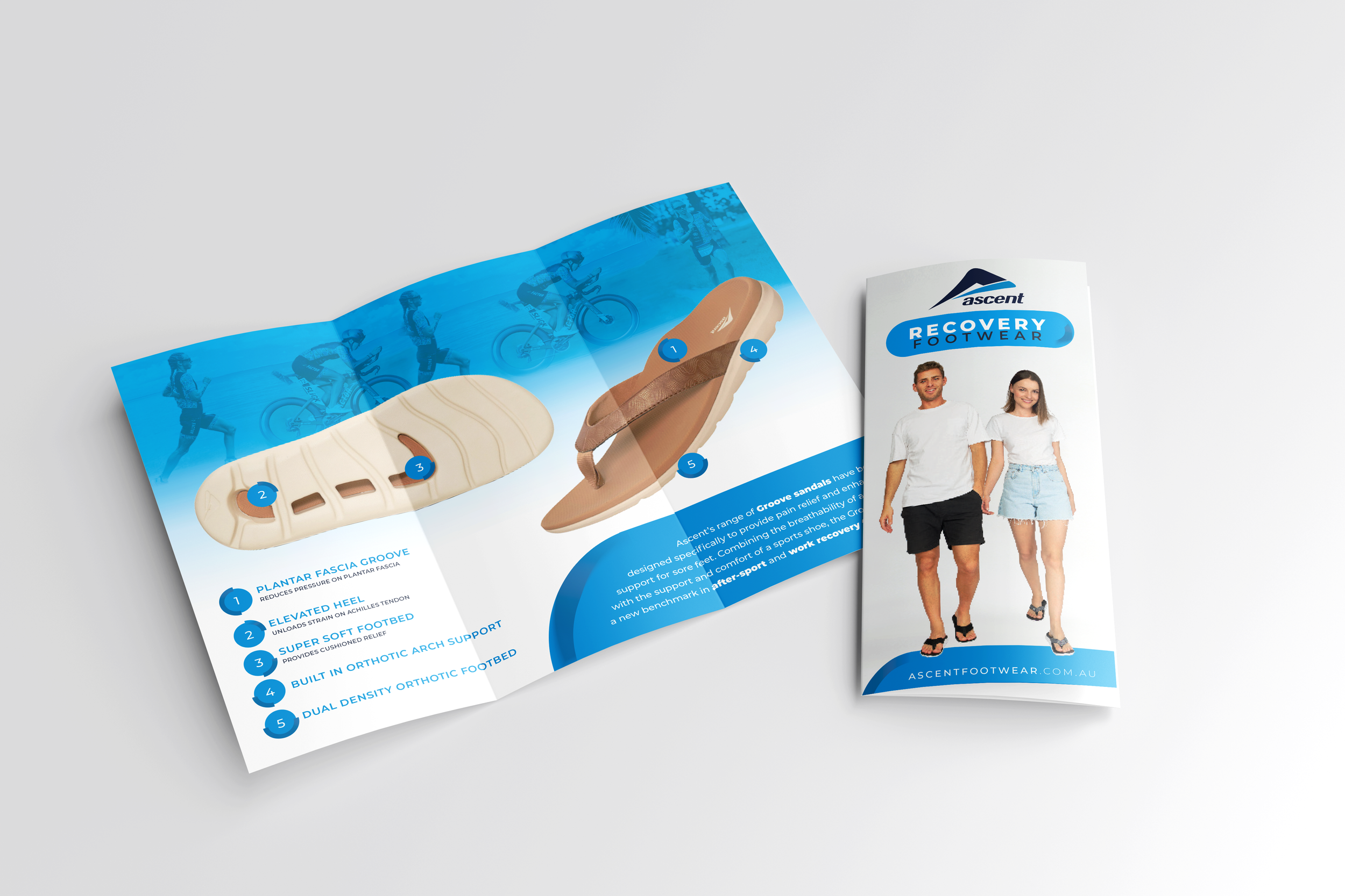
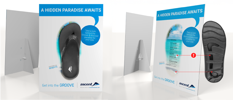
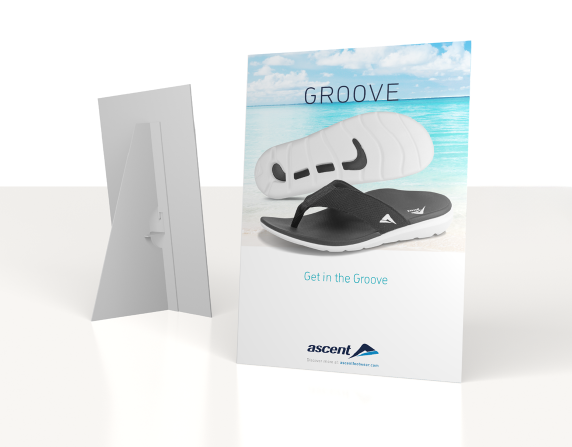
For Ascent’s recovery footwear range, I designed a strong event led presence tailored to endurance athletes across marathons, triathlons and Ironman events. I delivered a comprehensive suite of assets including displays, signage and promotional kits for major events such as City to Surf, marathons, trade fairs and expos, and I coordinated pack up and logistics to ensure everything arrived on time and presented flawlessly on site.
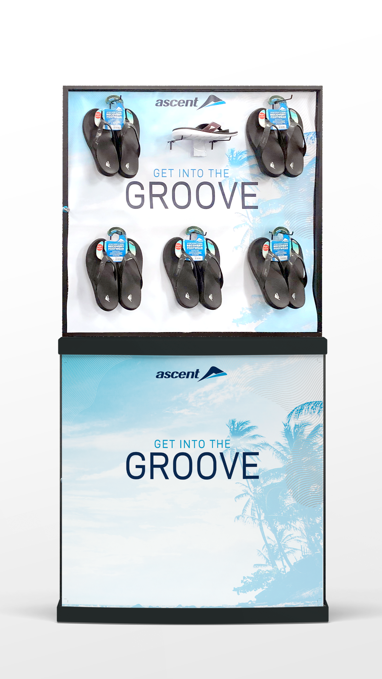
I invented a unique solution that transformed standard stock transportation cages into innovative, branded centrepieces that could be reconfigured for different events.
The solution became a signature feature of Ascent’s event presence and generated interest from other brands seeking to adopt it for their own activations.
SCHOOLS
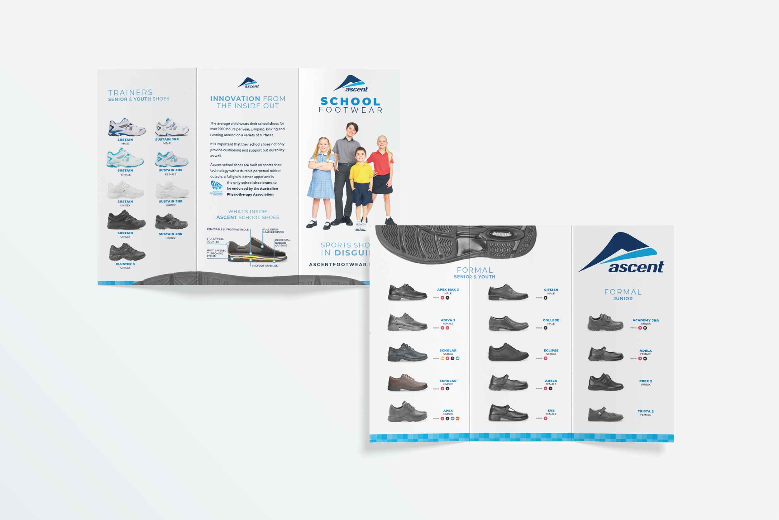
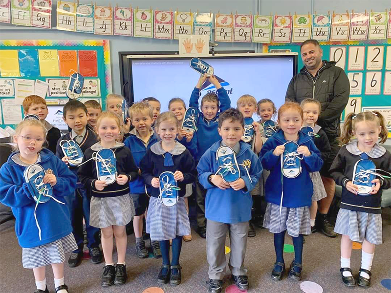
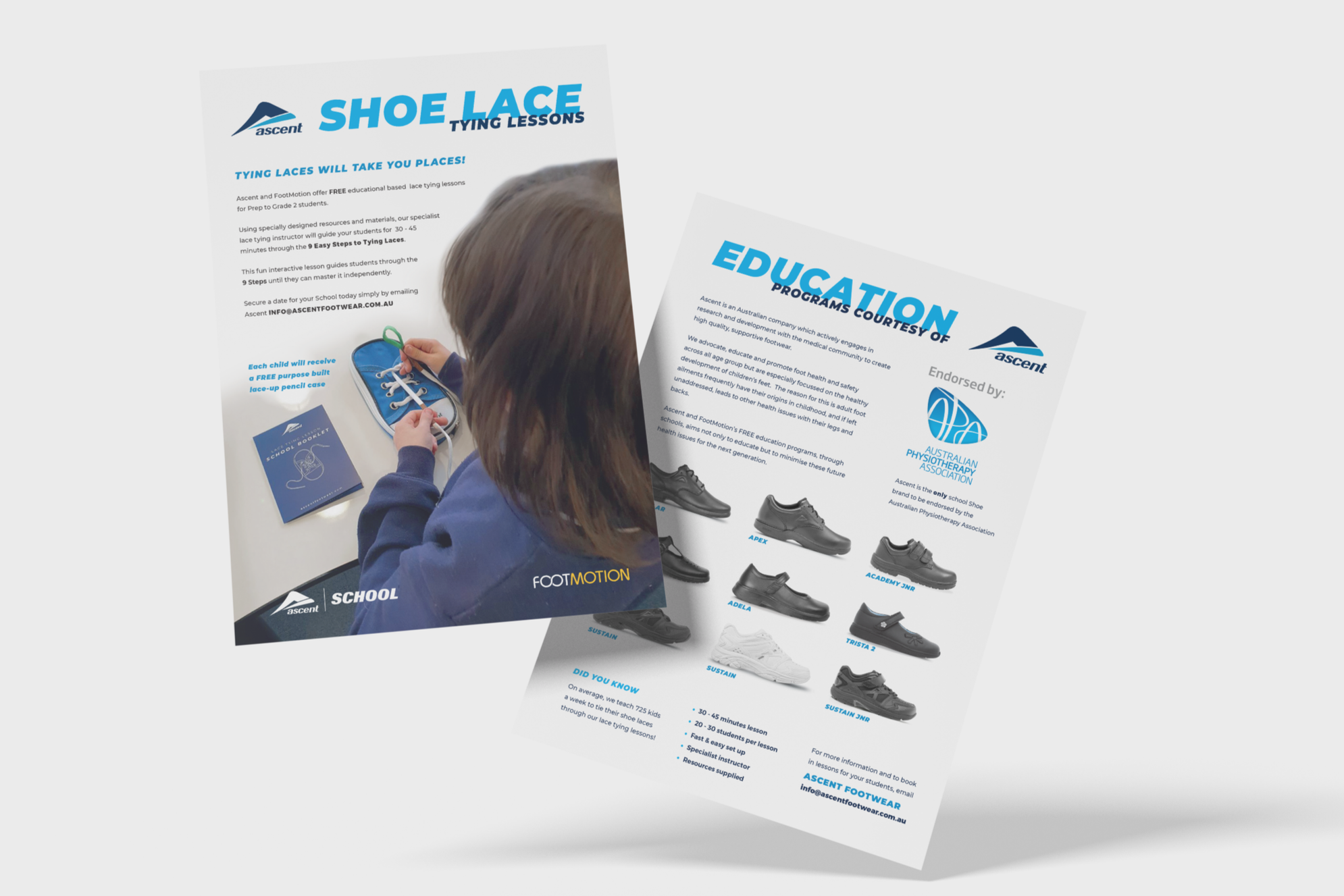
Ascent’s school program built early trust through free lace tying lessons, positioning the brand as a partner in learning. Fragmented assets and the absence of a clear CTA meant parents had no prompt to connect with the brand or continue into a follow up funnel beyond the classroom, limiting longer term engagement.
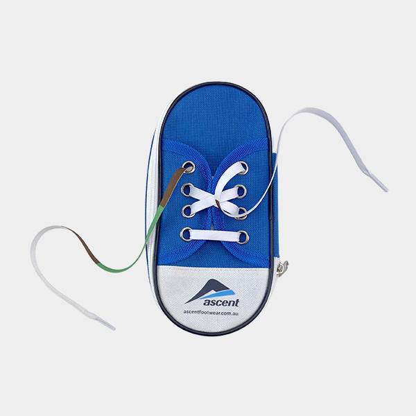
I redesigned the lace tying kits to include take home assets for parents, with a strong educational focus and a simple CTA directing them to Ascent’s social channels.
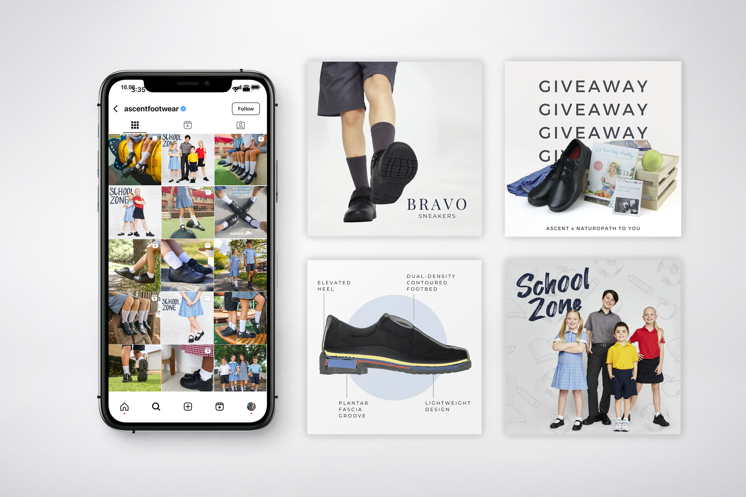
These linked to competition mechanics where parents received entry for submitting lifestyle photos of their child wearing Ascent shoes resulting in higher sales, enhanced brand storytelling and increased social followers. This also created a life photo library Ascent could use for marketing and promotions.
WORK RANGE
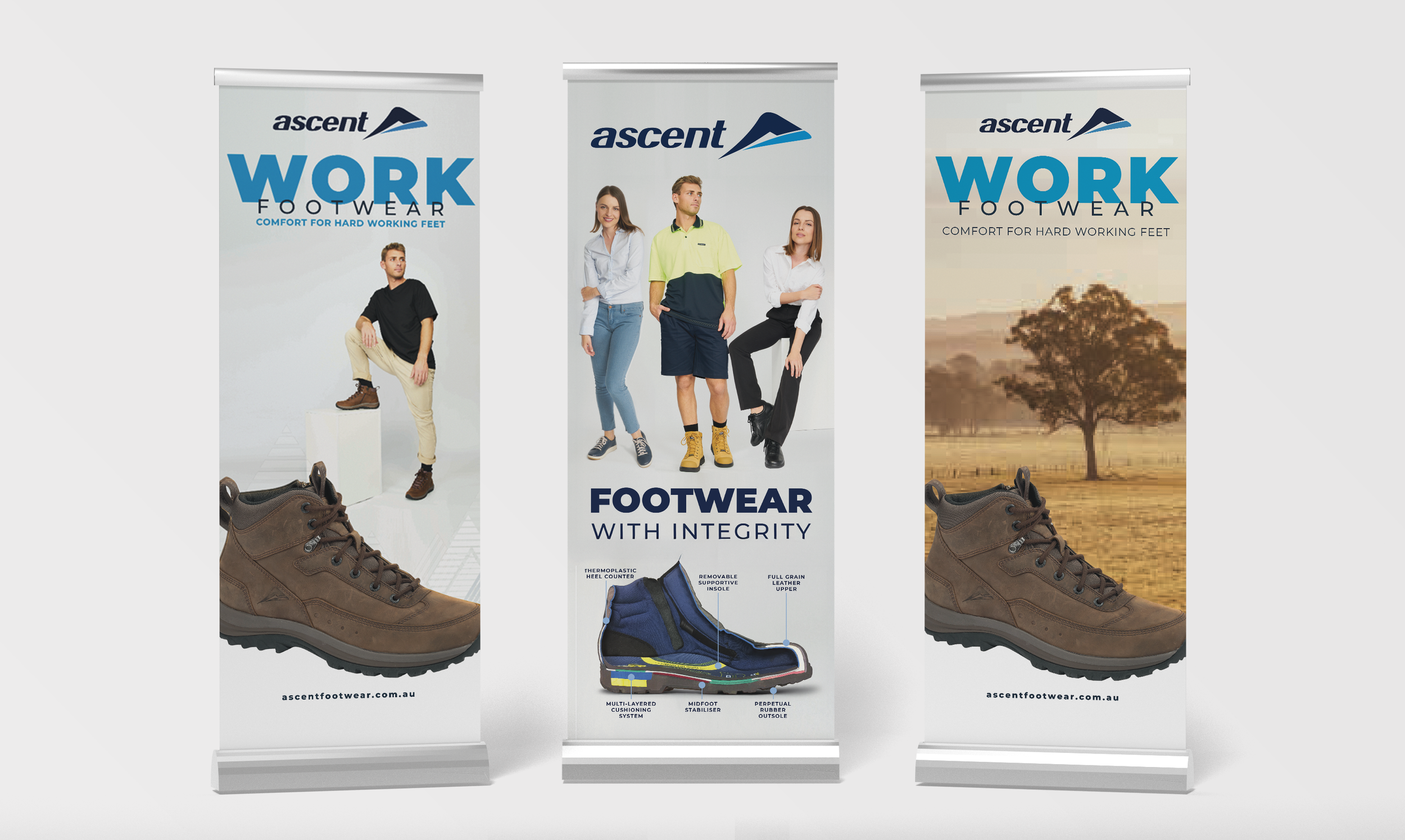
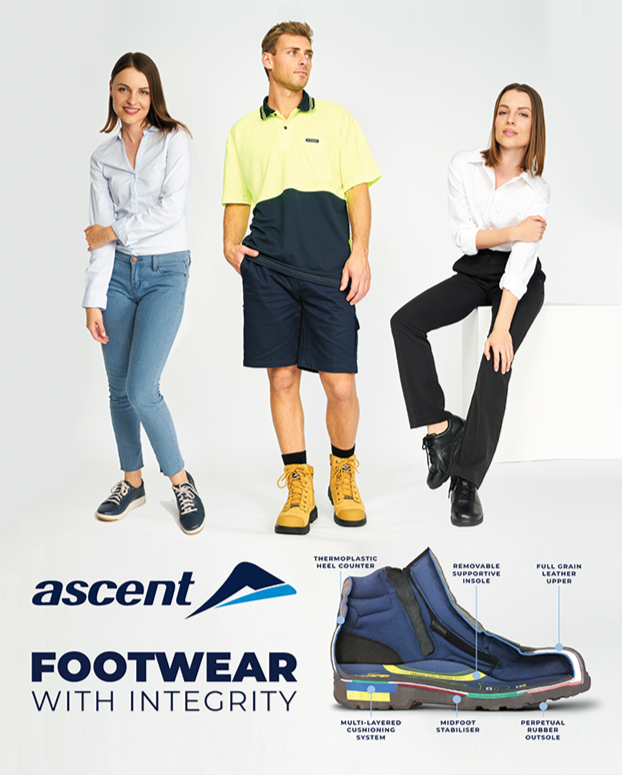
I identified that a unified design solution would not cut through across construction, nursing, farming, light industry and casual wear. I built niche specific asset systems for each audience, delivered through POS, displays, marquees and event kits used at trade days, gymkhanas, union fairs and exhibitions. All assets were anchored within a clear Ascent framework, driving stronger relevance on the ground while improving recognition, impact and sales across these markets.
These pull-up banners demonstrate how a single style was positioned to resonate across several niches through targeted imagery.
LEFT Urban, light industry and casual wear
MIDDLE Union, educational and conferences
RIGHT Gymkhanas, ag events and field days
PROJECT
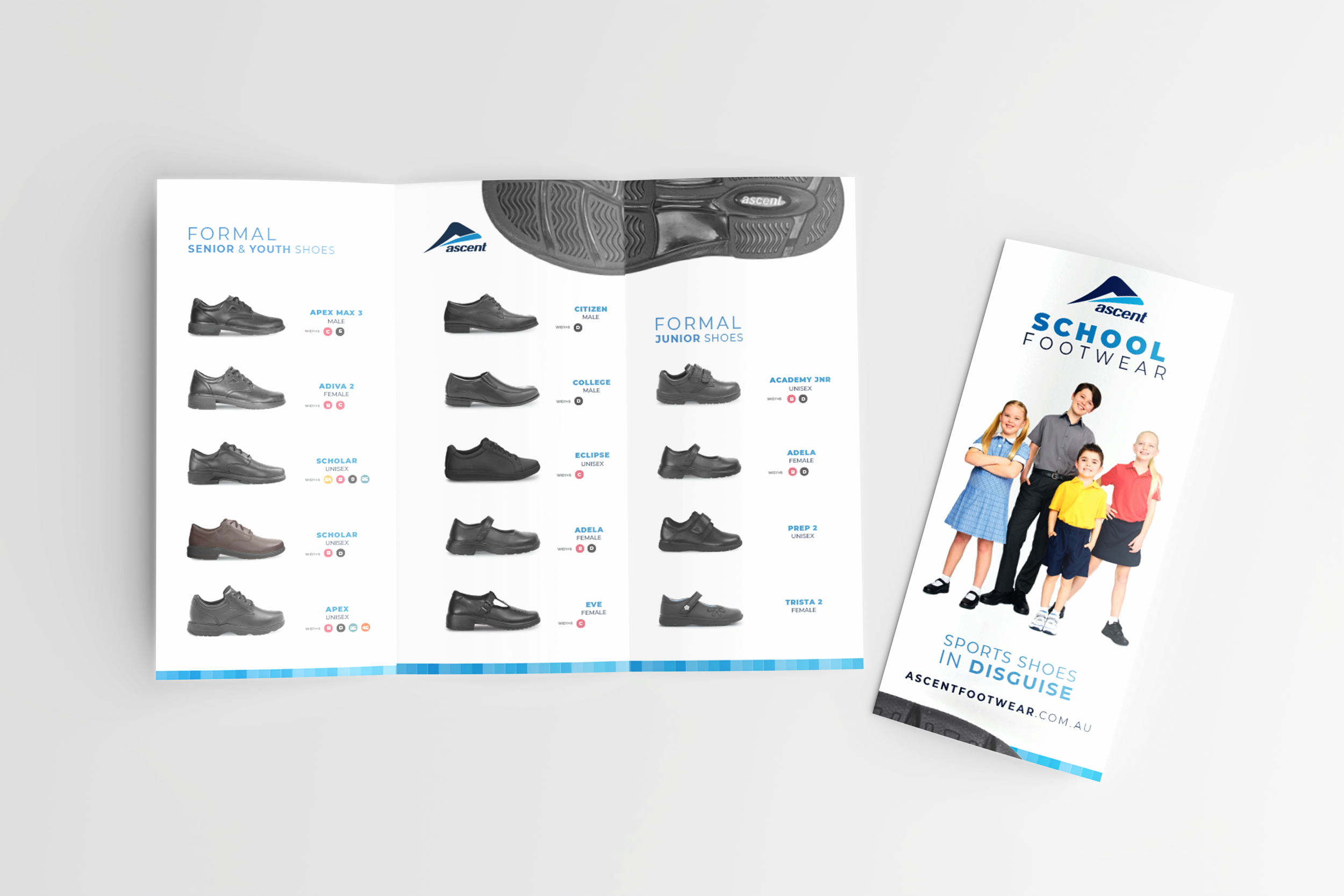
Ascent had fragmented and dated branding, inconsistent visual styles and gaps in the asset library. Its digital, print and event presence lacked consistency, and newly acquired brands felt disjointed under the Ascent umbrella. Ascent wanted to grow but was limited by low brand recognition and a weak market presence despite having robust products which were often over shadowed by their competitors’ inferior products with sharper marketing.
ACTION
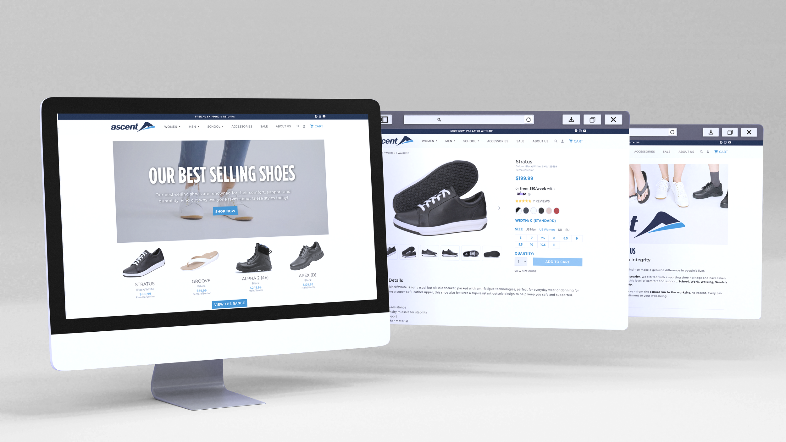
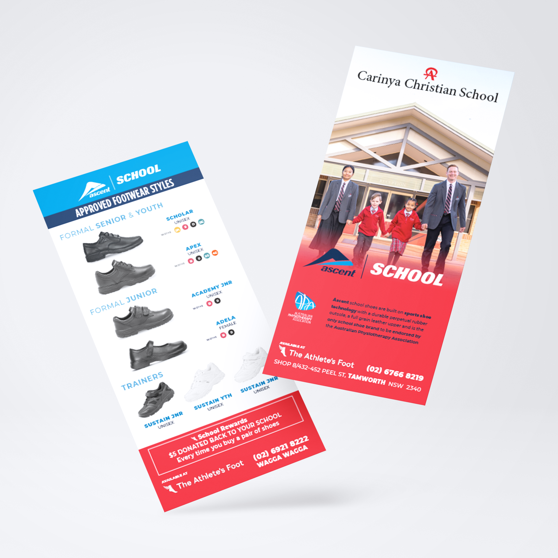
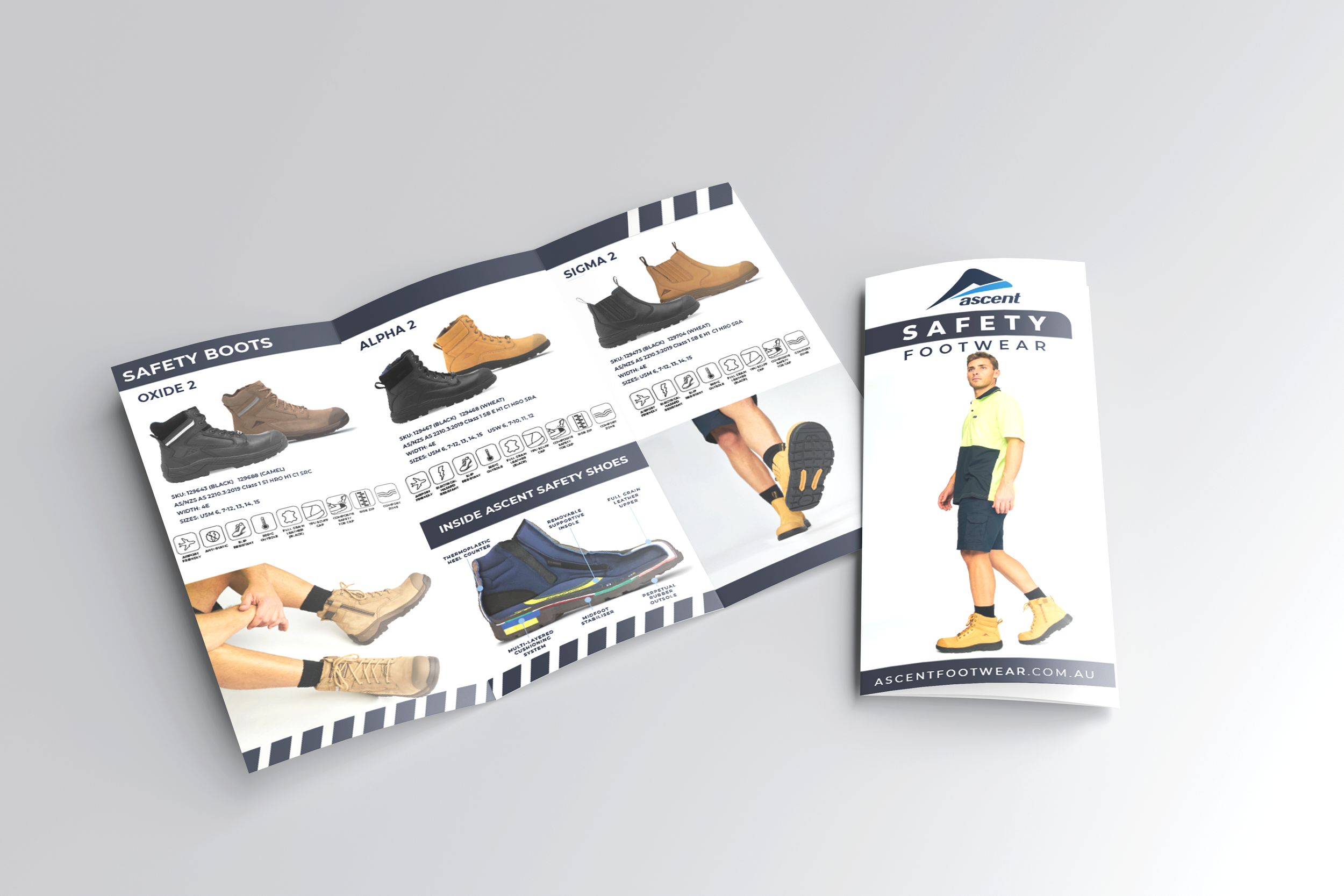
I redesigned existing assets to unify them under the Ascent brand and extend consistency across their brands and ecosystem. This included building a streamlined DAM and delivering aligned digital assets, oOh!, POS, in-store artwork, brochures, print, signage, wraps and event collateral to create a clear, cohesive brand presence across all touch-points.
RESULT
I established a strong, cohesive digital and print footprint that supported growth and expansion, allowing each brand to retain individuality while remaining clearly unified under the Ascent umbrella. Improved brand clarity across all touch-points increased product strength recall, driving higher sales of hero styles, broader range uptake, stronger customer engagement and an uplift in 5 star reviews.


