
PROJECT
Southern Skies Media is an internationally recognised aviation and podcasting business looking to grow its audience, attract new commercial clients and build a stronger presence at major industry events. Much of its work happens behind closed doors, so visibility at events, trade shows, conferences and airshows is essential. I was brought in to refine and unify the brand across digital, print and live event touchpoints so the dual focus, aviation and podcasting, came through clearly wherever it appeared.
ACTION
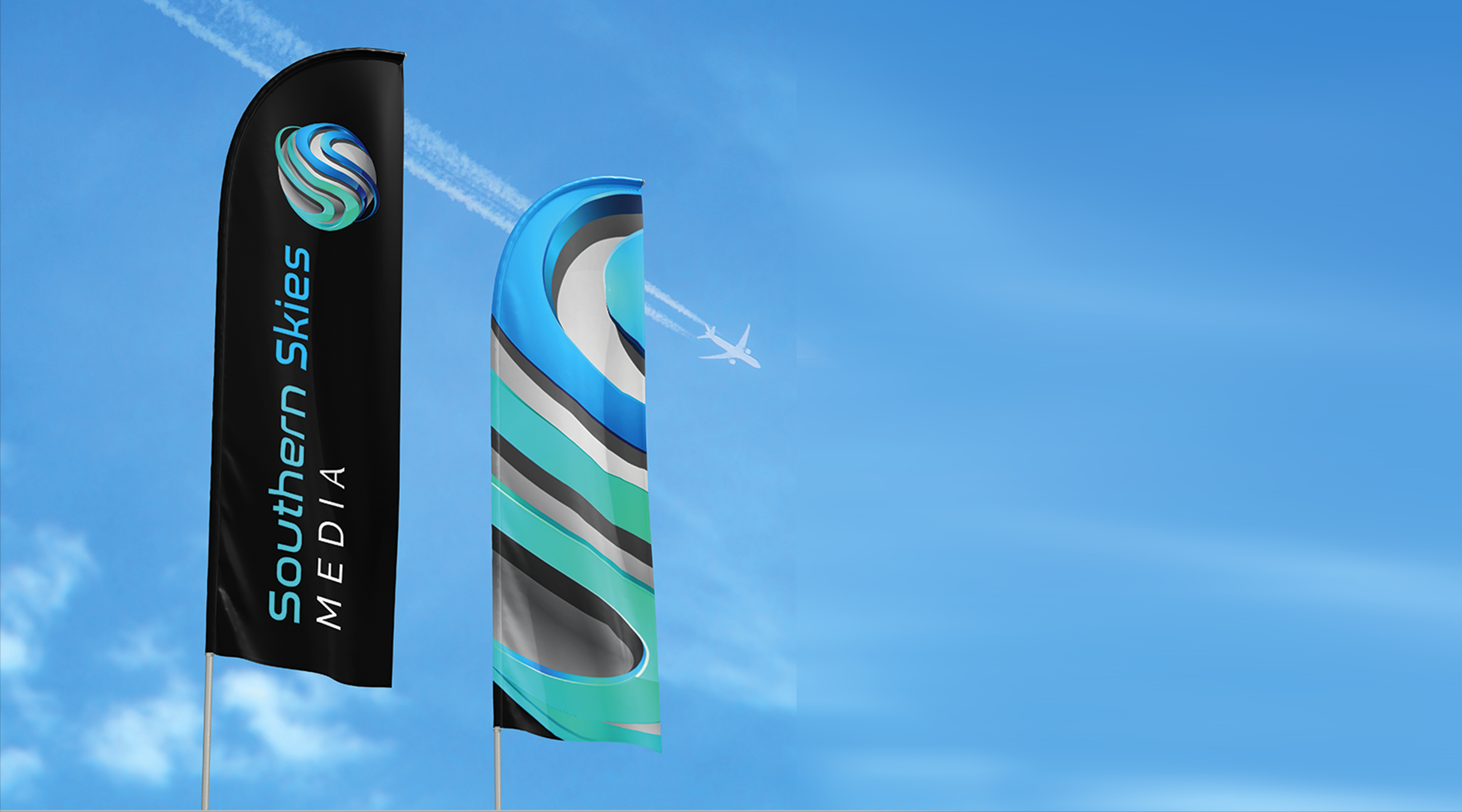
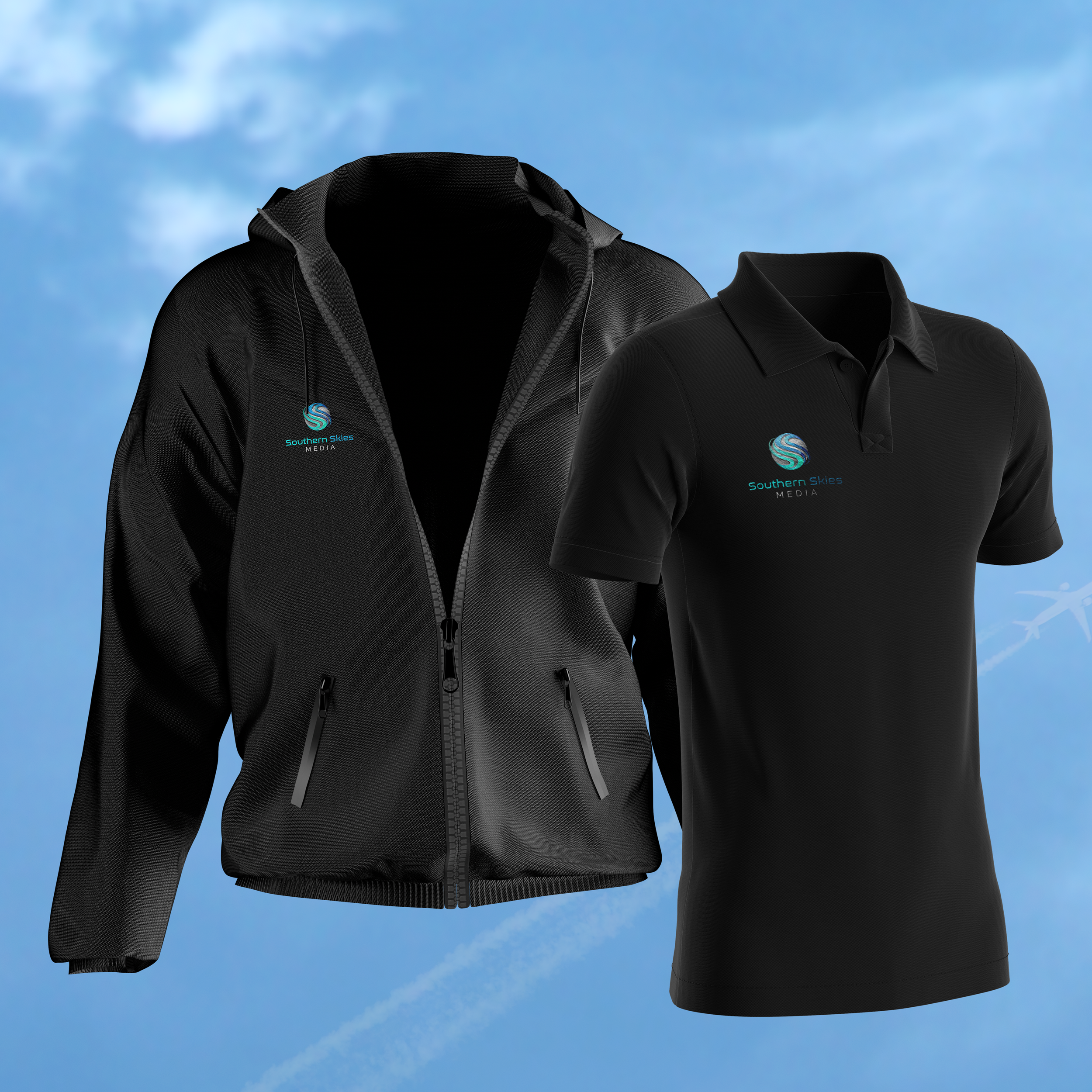
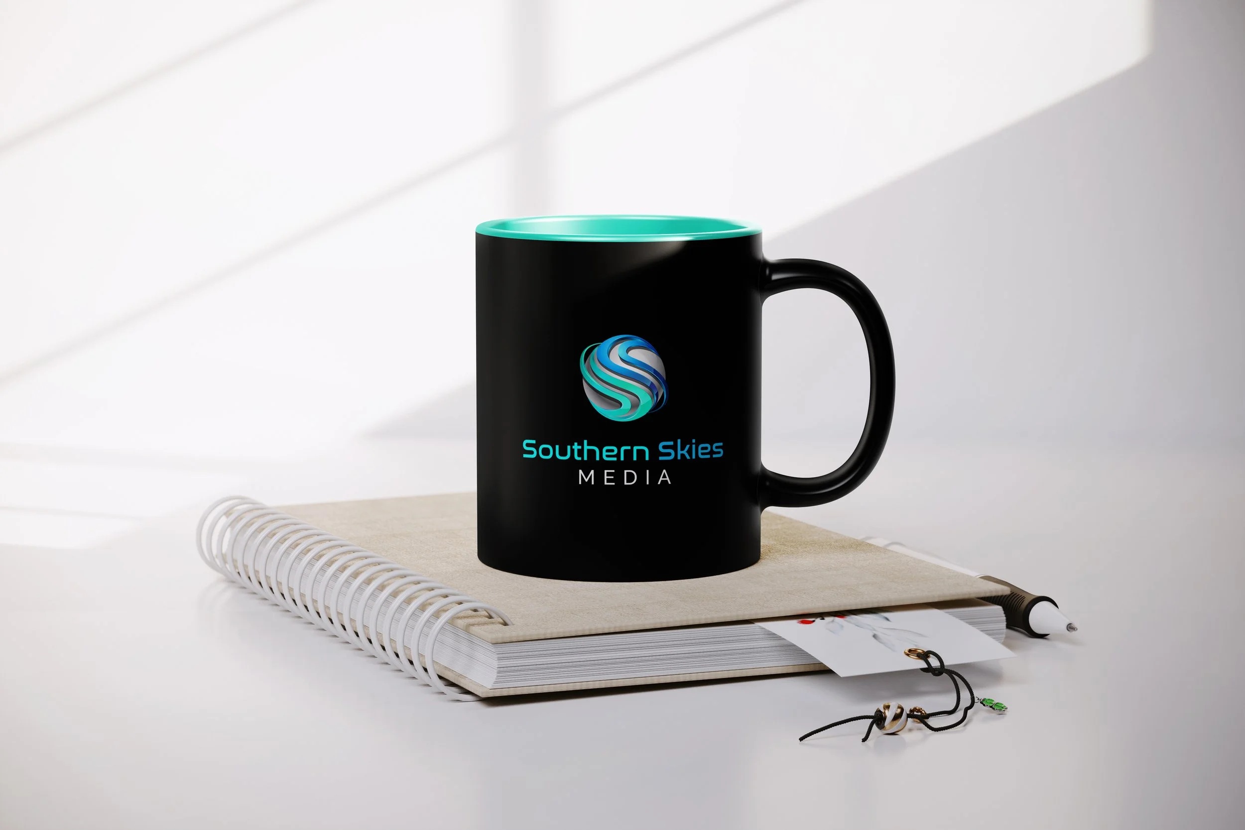
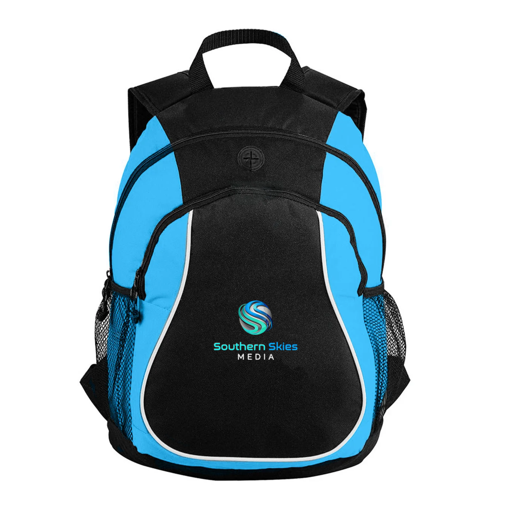
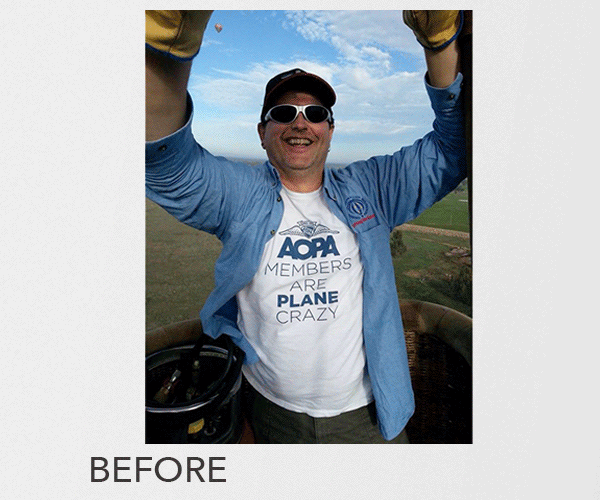
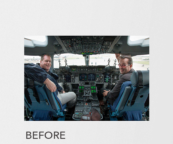
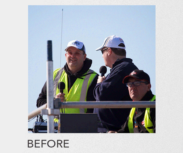
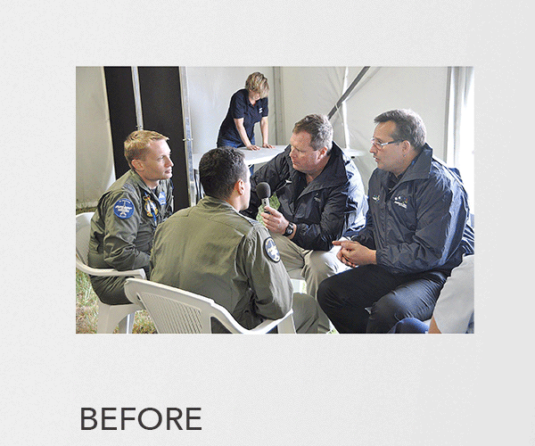
I developed a contemporary, aviation-inspired logo and a cohesive visual identity that worked across both arms of the business, anchored by a blue-based palette chosen for its associations with trust, precision and reliability, with each niche given its own accent colour for impact. I redesigned and delivered a new WordPress site alongside the onsite developer, upgraded the image library through structured retouching and AI editing to build a reusable visual bank, and designed event-ready merchandise and collateral for airshows, expos and conferences, including international events.
RESULT
I delivered a cohesive, professional brand that clearly communicated the dual aviation and podcasting focus and strengthened the company's presence at national and international industry events, giving each niche its own identity while keeping them recognisably part of one brand.

DIVERSE NICHES
The Southern Skies Media clients base is diverse catering for aviation, defence, airshows, packaging and printing. The challenge was to present this breadth as a unified niches under a cohesive brand banner without feeling misaligned.
A cohesive visual system anchored by a shared blue-based colour palette, chosen for its association with trust, precision and reliability across technical and commercial sectors. Each niche had it’s own identifying colour for pop impact allowing each niche to maintain its own identity while the anchoring blue created a clear visual anchor which connected them to the one brand
The unified system strengthened recognition of the niches being a segmant of a bigger brand, giving weight and credibility, positioning Southern Skies Media as a consistent, adaptable partner across multiple industries.